When you have your own business, it’s no longer enough that you have a good product or offer good service. It will not make much of an impact if no one is aware of your existence. These are the signs of the times that even in the modern age, nothing beats a clear and visible sign.
In the big cities, it would be best to work with a sign company. In Los Angeles and other main cities, professional sign makers know the best strategies to have an effective sign that can really attract the attention of onlookers and passersby. Some of them are shared here.
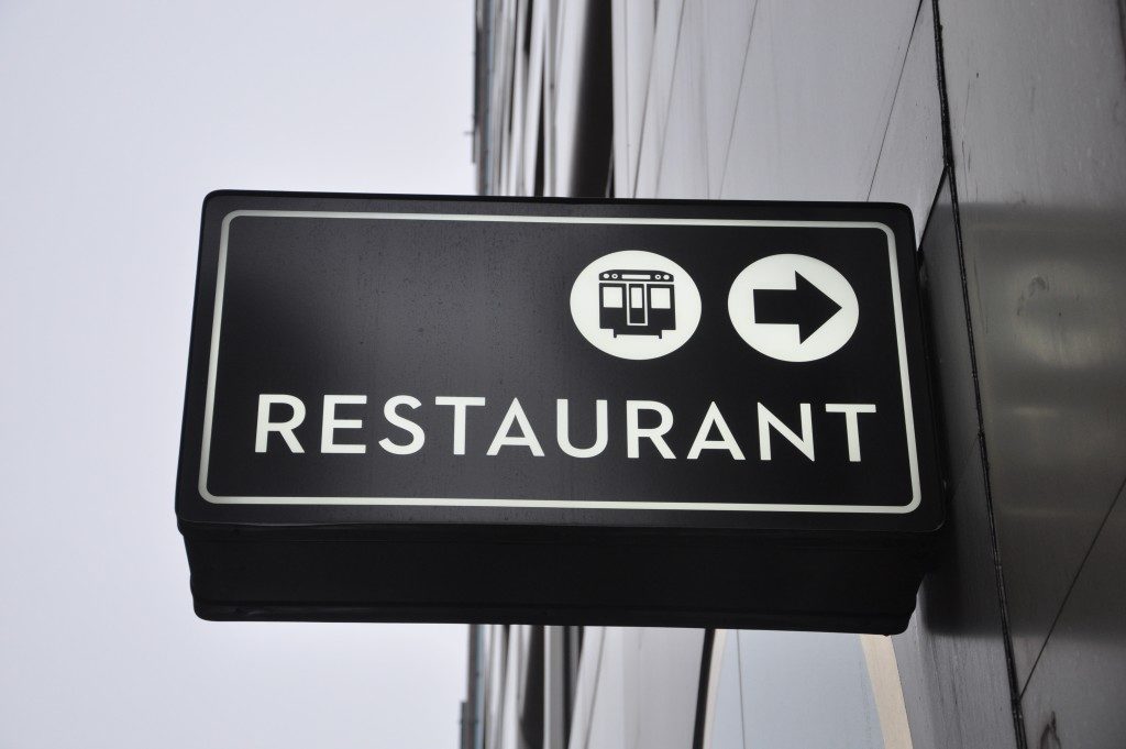
1. Choose a good location.
The basic tenets of good signage would be an attractive sign with a few words situated at a smart visible location. The old adage holds true in this instance, as the location is truly vital to the effectiveness of your sign. Aside from the location, you must also test its visibility. Can it be seen from ground level?
This is important to address since most people, by default, would be at ground level. Can it be seen at different hours of the day? You must consider how there could be glare during the daytime, and the sign would not even be readable.
On the other hand, you should also check if the sign has ample lighting in the night time. If your sign is not a neon sign or an LED light, then you should provide lights to illuminate it. Will the sign be exposed to the elements?
Almost all signs would probably be subject to wind and rain if they are located outdoors. This is often a consequence if you choose a location with maximum visibility. In that case, you need to ensure that the material used for the sign is waterproof or water-resistant.
It would also be your duty to make sure that the sign is well maintained and clean, free from dust or dirt buildup. If your sign is dusty and dirty, it gives the impression that your business has actually closed down.
2. Use readable fonts — even from a distance.

While signs can also be considered as a work of art, it is primarily a utilitarian medium with a definite function. There are some signs which, in an attempt to be creative and trendy, ended up with a font that was not legible.
Even if you have a good color palette and prime location, you fail to get the message across, and that is why you had the sign in the first place. Make sure you use a font that is legible from a distance.
Since the motorist or pedestrian may not have any more than 5 seconds to read your sign. If it does not make sense to them, they are likely just to move on.
Another point about the font is that it is better to use contrasting colors. There have been studies that reveal which color combinations have the highest level of contrast. It is best to choose those combinations unless you have trademark combinations already.
3. Be concise with words that aim to connect.
The purpose of the sign is to inform and connect. You inform them of your company, where and how they will contact you. It was meant to lead and connect the customer to you. It is not meant to answer all of the customer’s questions.
Placing too much information on a sign can make it look cluttered. You have to use a smaller font, and that could compromise visibility. It is best to simply introduce your product or service, contact information, and a catchy slogan to keep you in their heads.
In this day and age, there are so many distractions for people, too many things demanding their attention. Your sign has to take this into account, and you may have to make adjustments from time to time. Investing in a sign is necessary, though, and these tips can help make it worth your time, money, and effort.